
PROTEIN BAR · BRAND IDENTITY · PHYSICAL TO DIGITAL
FORGE
Tying a protein bar to something you have to earn.
FORGE is a protein bar brand built for people who value strength, discipline and steady progress. Its starting point is the way metal takes shape under pressure and heat: progress is not a single event, it is something hammered out by repetition. So the brand talks about a state that has been earned, not a result handed over.
Shape Yourself with Pride.
The mark is an anvil: effort, discipline and transformation gathered into a single form. The molten chocolate running through its middle ties an abstract metaphor straight back to the product itself. The heavy geometry holds the same weight on a wrapper and at app-icon size, and the brand’s core value — pride — comes out of it.


The system runs
on one discipline.
Typography, palette and characters all answer to the same rule set. The point is that the brand keeps its character as it moves from a wrapper to a poster, from a screen to a physical object.


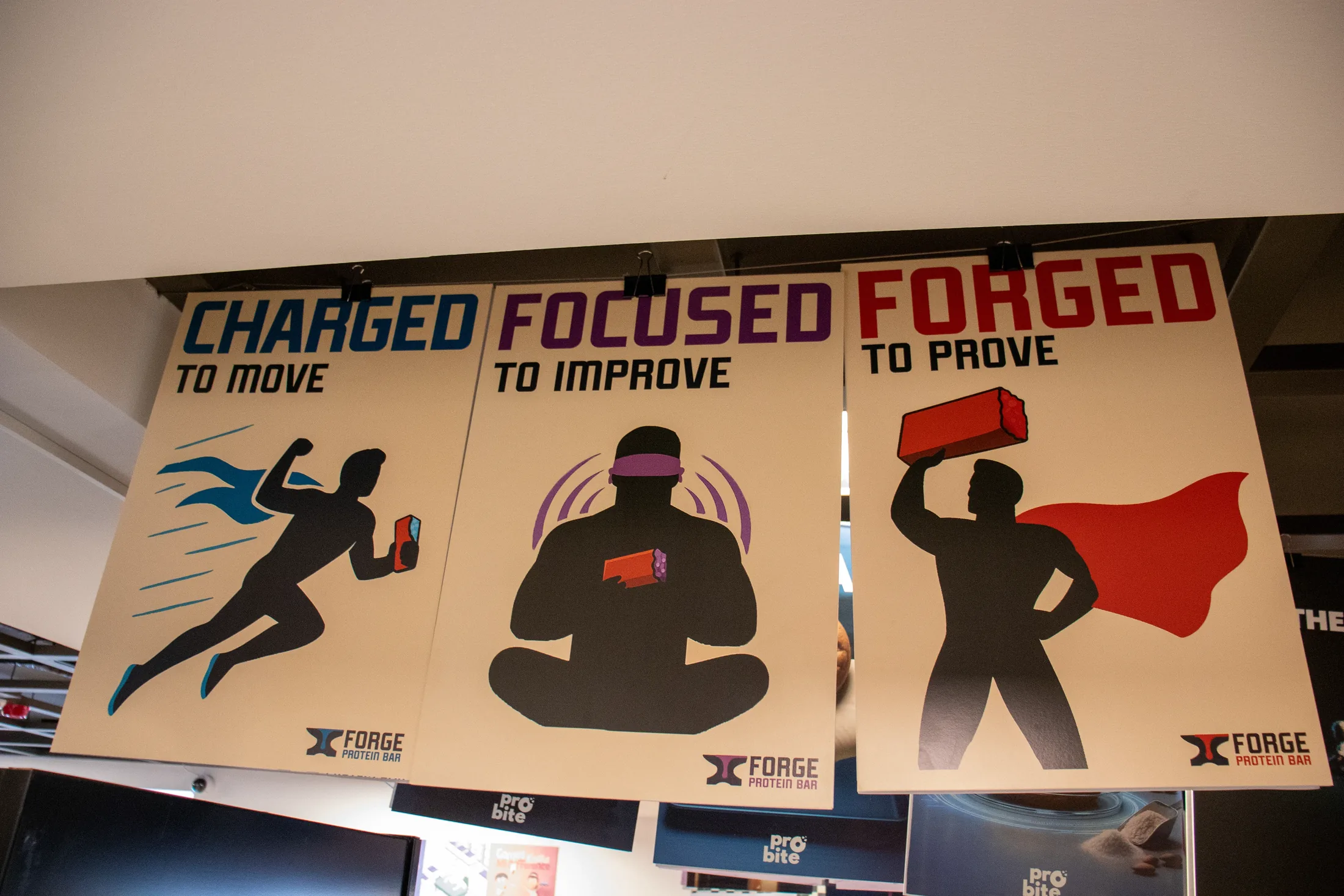
Three characters,
three words.
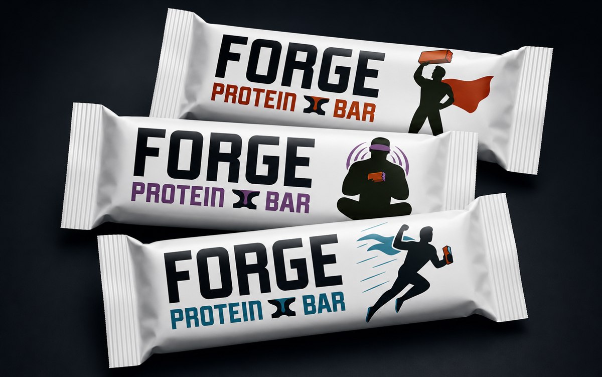
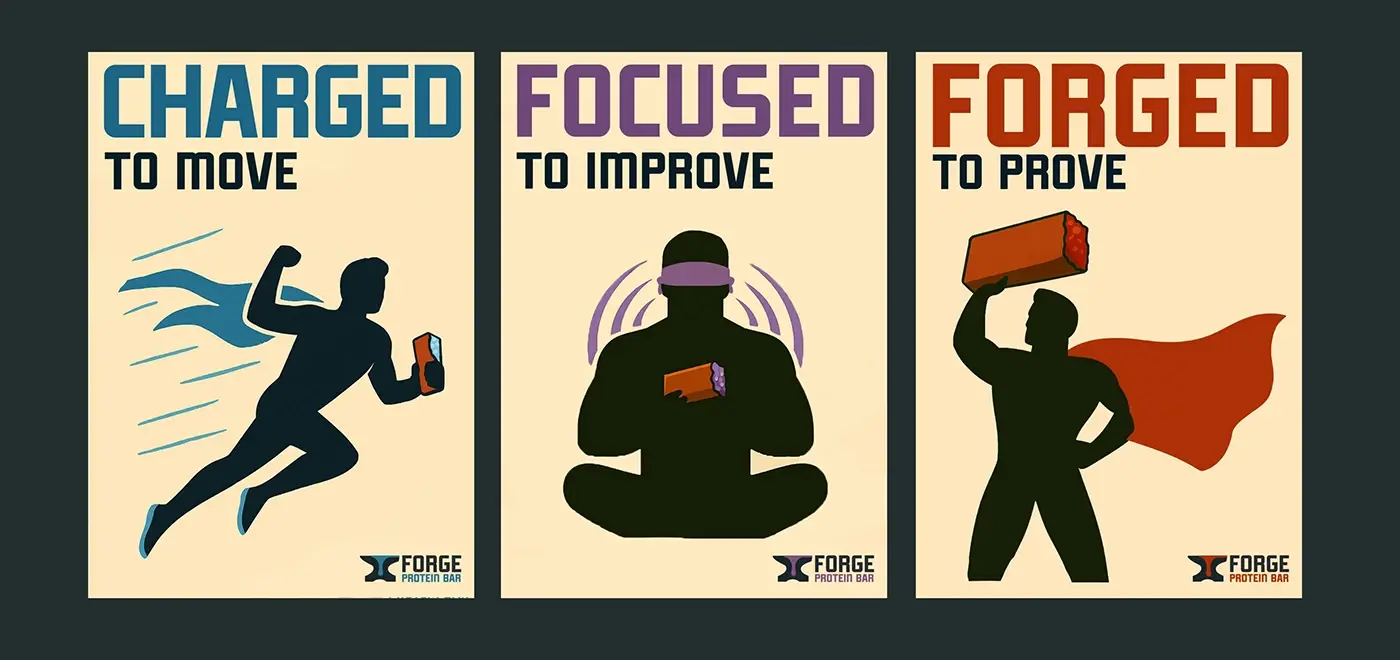
The poster series is the spine of the brand: a figure who runs, one who focuses and one who proves, matched to three flavours and three words. The brand film is those same three words stretched over time.
Print turns
into motion.
Stretched over time, the three words of the poster series become the brand film. Typography and figures keep the discipline of the still compositions while they move.
The same weight
on screen.
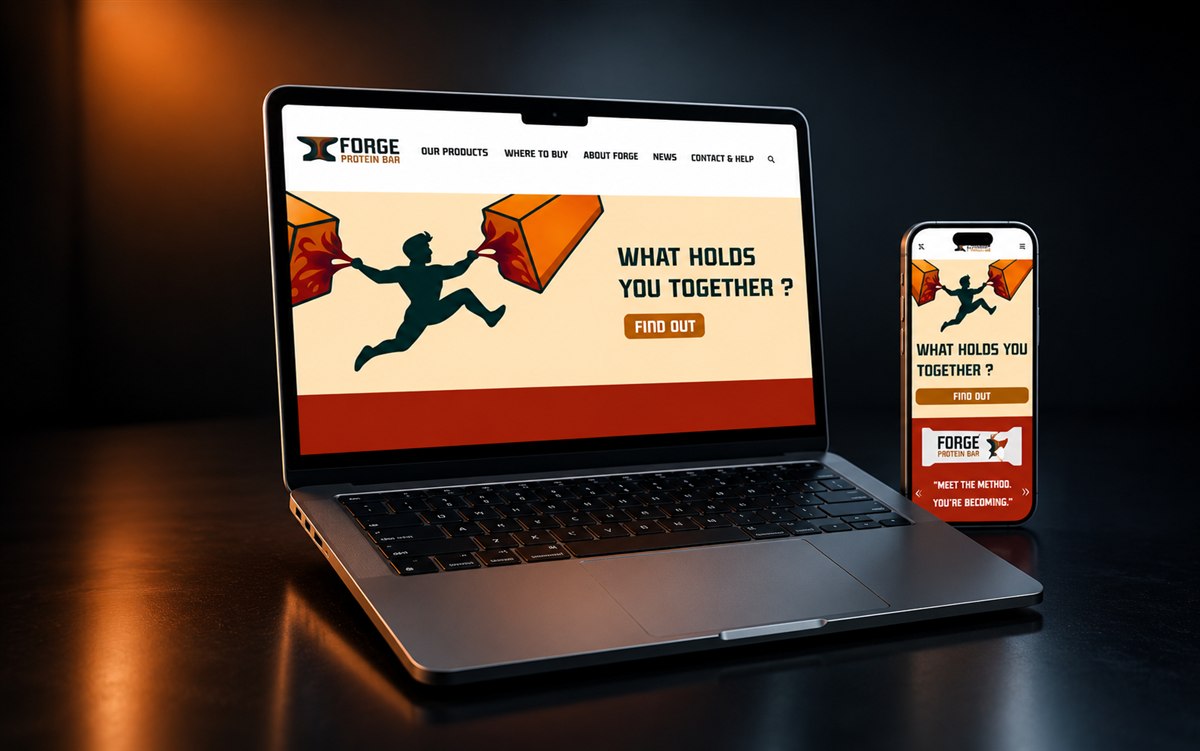
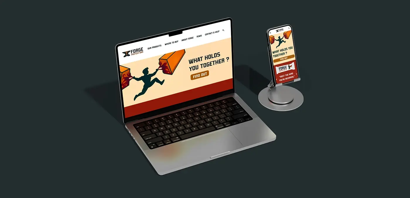
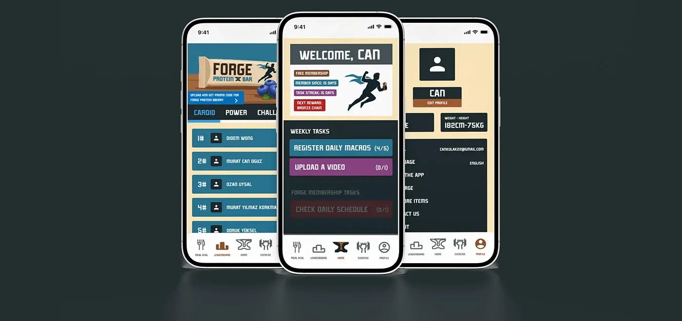
The website and the mobile app carry the identity’s heavy typography and its performance rhythm onto an interactive screen. The opening question is the brand’s own: What holds you together?
Not a membership,
a collection.
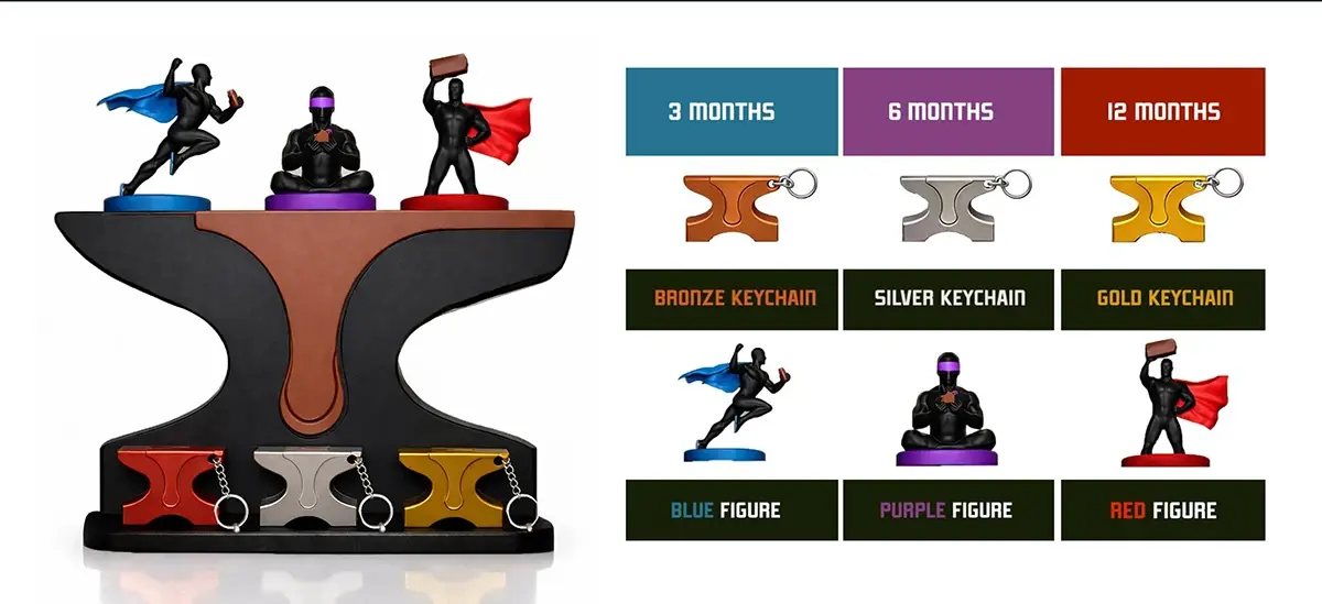
Three, six and twelve month memberships come with bronze, silver and gold anvil keychains, and the three figures of the poster series turn into collectible objects. A digital subscription is rewarded with a physical shelf.
The brand becomes
something you can hold.
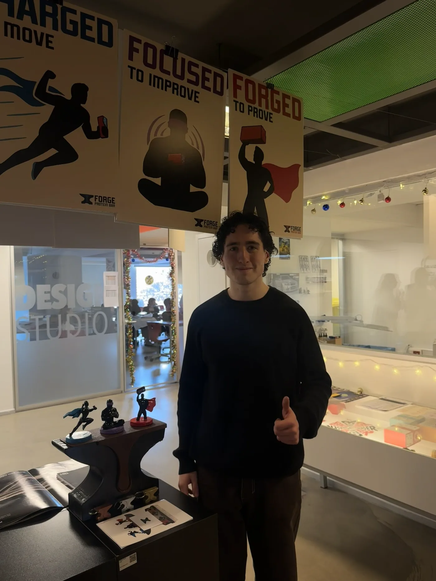
The characters and the display object were modelled from scratch, split into parts, 3D printed, sanded, painted and assembled. The system on screen ends up as an object that was actually made.


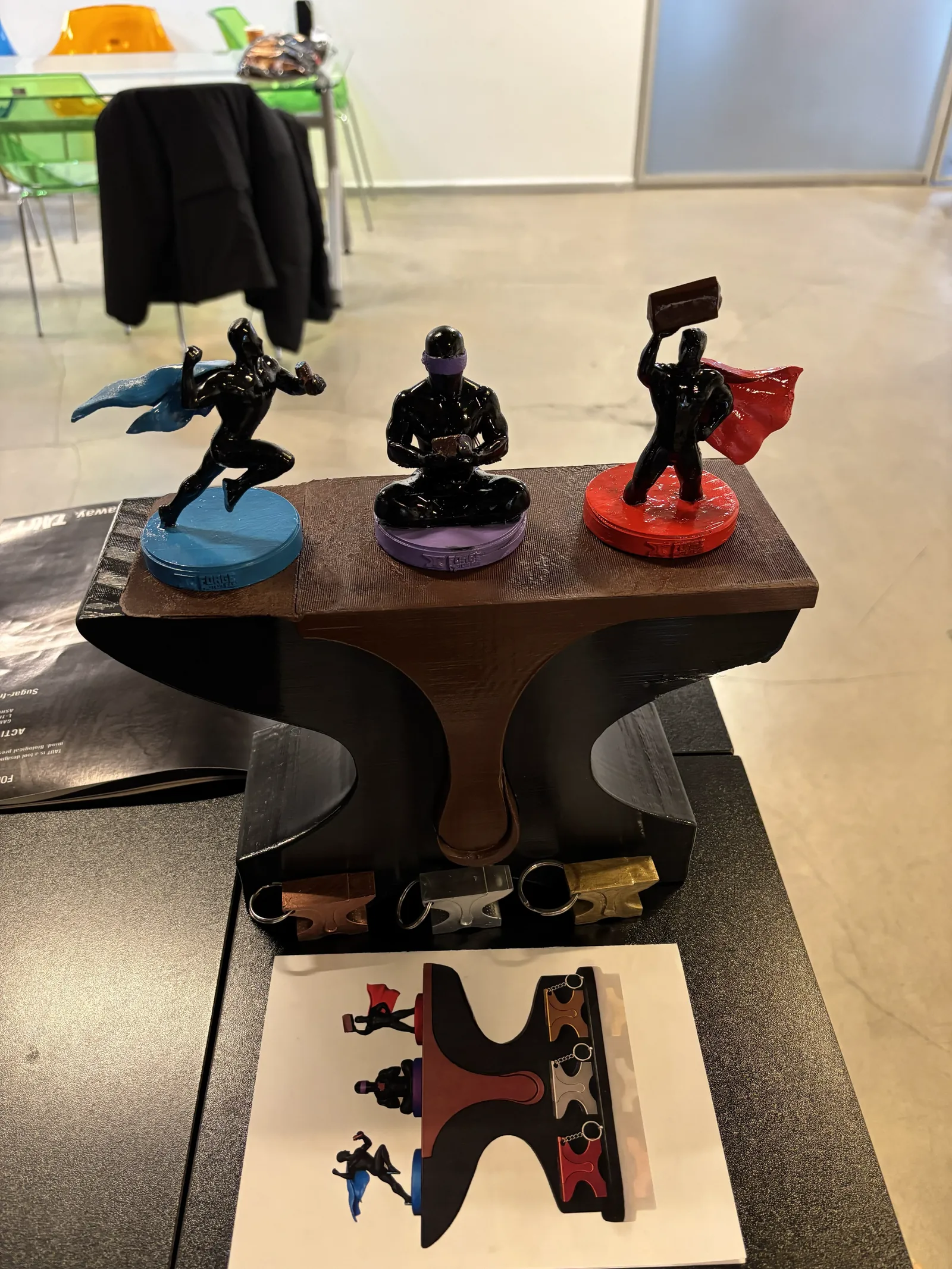
PHYSICAL PROTOTYPE
The poster series
made it to the shelf.
The figures who run, focus and prove stand on their own bases; the anvil is both the display object and the brand’s mark. The same system you know from the screen, sitting on a table.
The same form,
in your hand.
The membership keychains are the anvil shrunk down. One silhouette, repeated in three metal finishes.


FORGED TO PROVE